Google Medical
Problem
The health industry has been relying on paper for years. Making it harder and harder to access medical records when needed or to share files from doctor to doctor or patients to a new clinic.
Solution
A brand new android app to manage your medical records on-the-go. Adhering to Material Design and branding guidelines just like if I worked at Google.
Understanding
Surveys and interviews
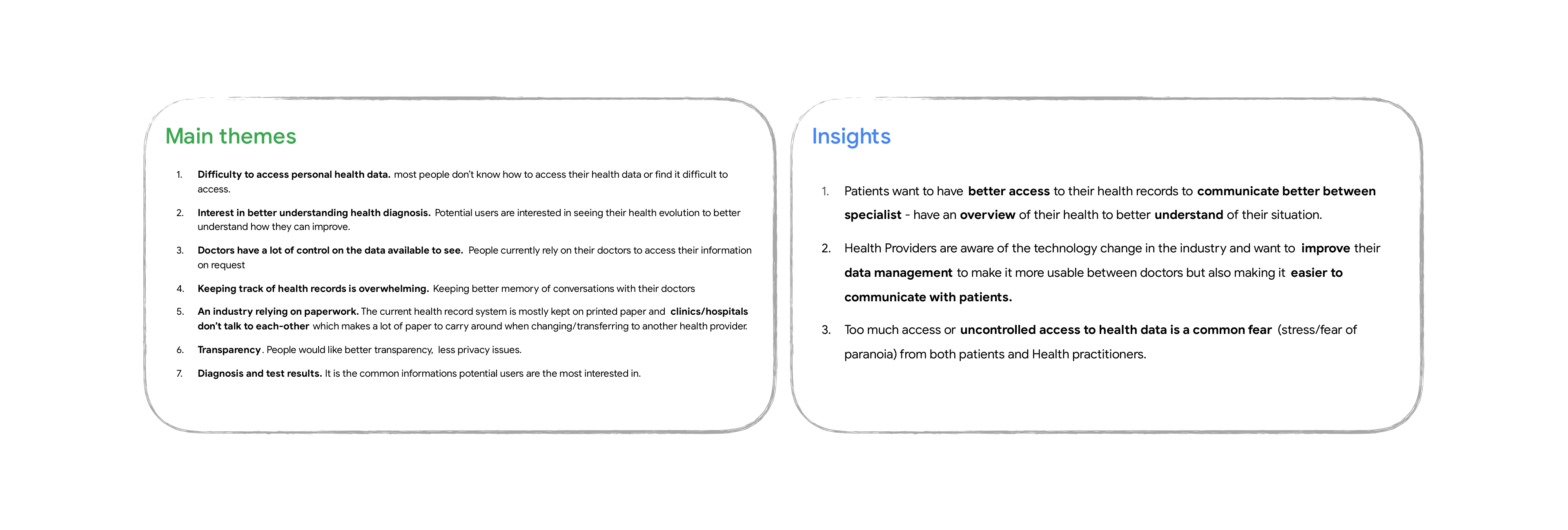
Research showed that the health industry is relying on paper which makes it difficult for everyone to access their own medical information without going through multiple steps. The patients want more transparency and the health providers are wanting to make a digital move for practicality but are concerned about their patients private data.
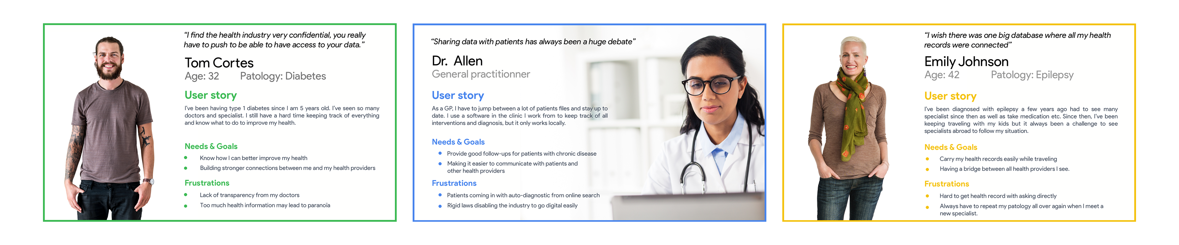
Persona Development
Building an app for patients medical records requires to not only understand the users but also the health industry. Following the survey and interview results, I came up with 3 personas that are representing two patients and one general practitioner.
Defining the experience
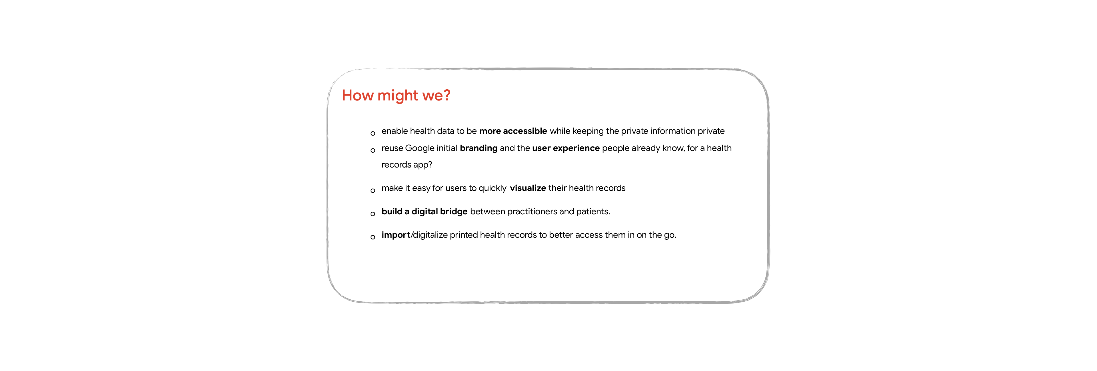
Brainstorming
Google has a lot of features and UIs from different apps that are already built that could work beautifully together if they were repackaged as a new app for medical records. The goal of this app is to be able to build a bridge between health providers and patients, making it easier to access all our own medical records from anywhere.
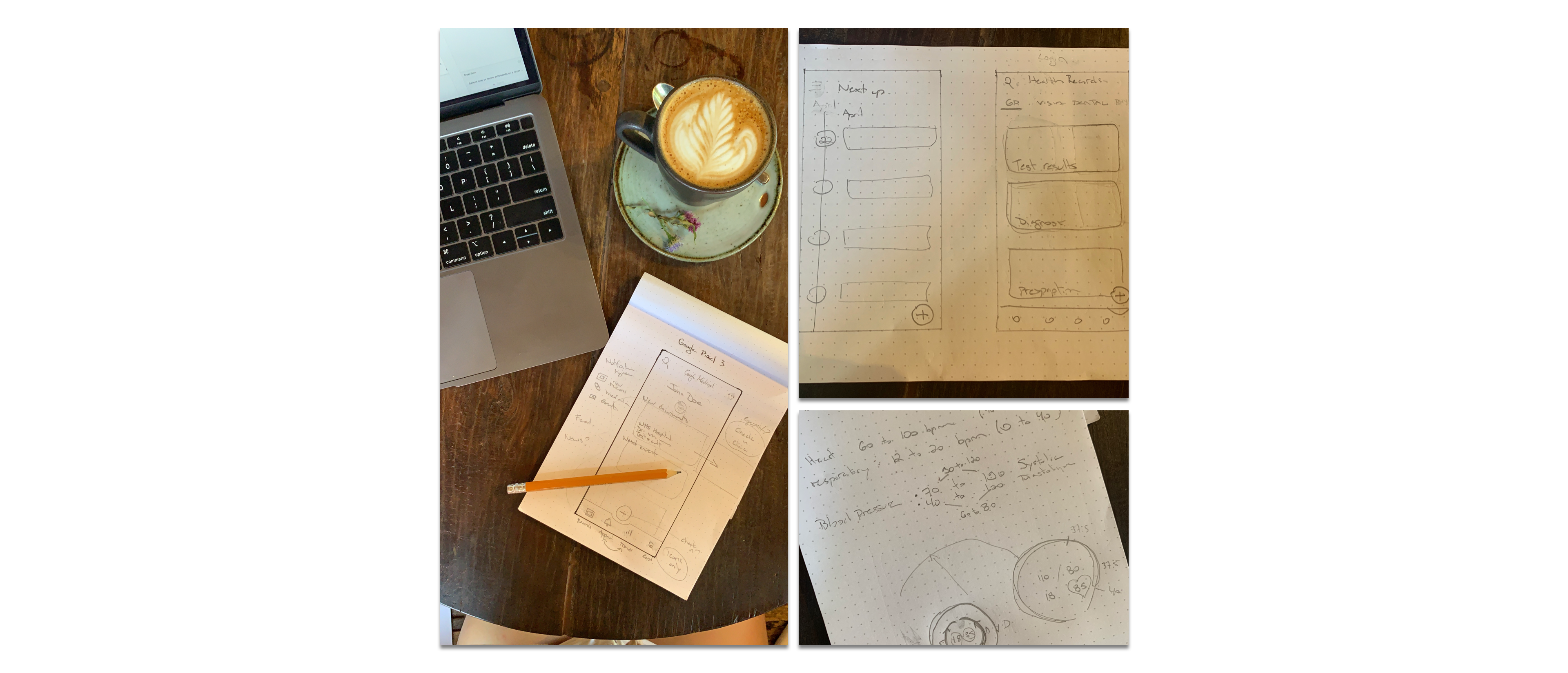
Sketches
I explored each and every google apps that were recently updated with the material design 2018 and selected the most interesting patterns that would fit with my health record app. I tested different layouts that could integrate the different apps patterns into what would soon be a new google medical app.
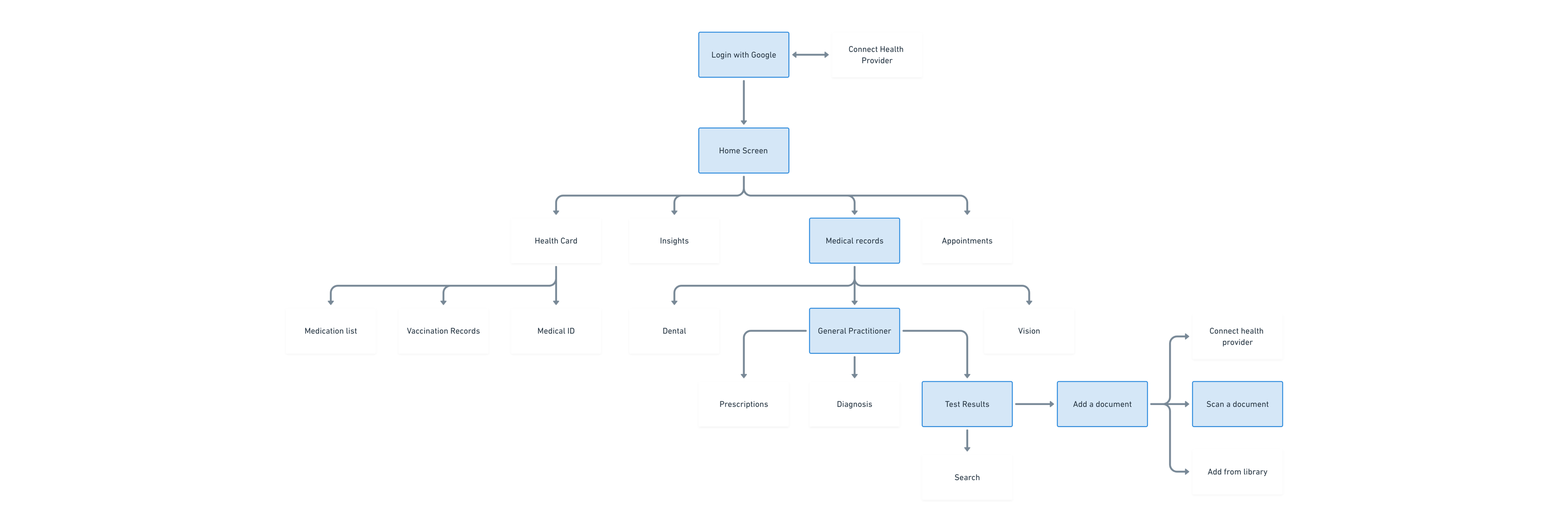
App map
It quickly became a big task. It’s easy to try to include every single feature possible, so to take better decisions on what would need to be in the app, I mapped it all out and deleted what wouldn’t be in the first version. From this, I focused on one specific task I’d like to explore, adding a new record manually using the scanning feature.
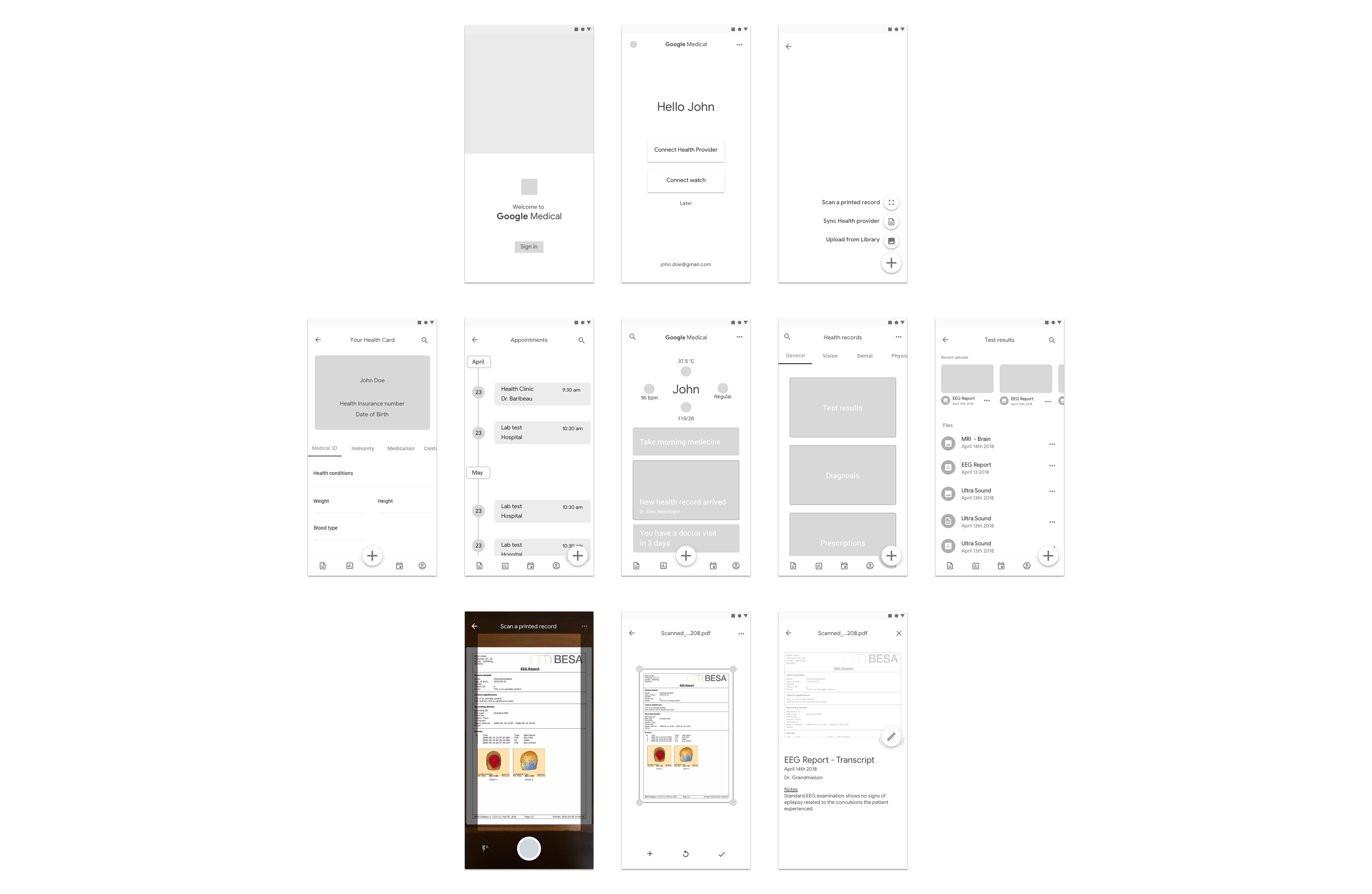
Mid-Fidelity Wireframes
I encountered a multitude of UX challenges during this project. I came in thinking that following a design system would be easy, but it actually required a lot of research, reading and getting the details right to make it feel just like another google app.
I’ve been also trying out different navigation patterns, starting with a sidebar then using the bottom bar. I finally decided to keep the main navigation bar at the bottom as it seemed to be the most accessible way for the user to find what they are looking for.
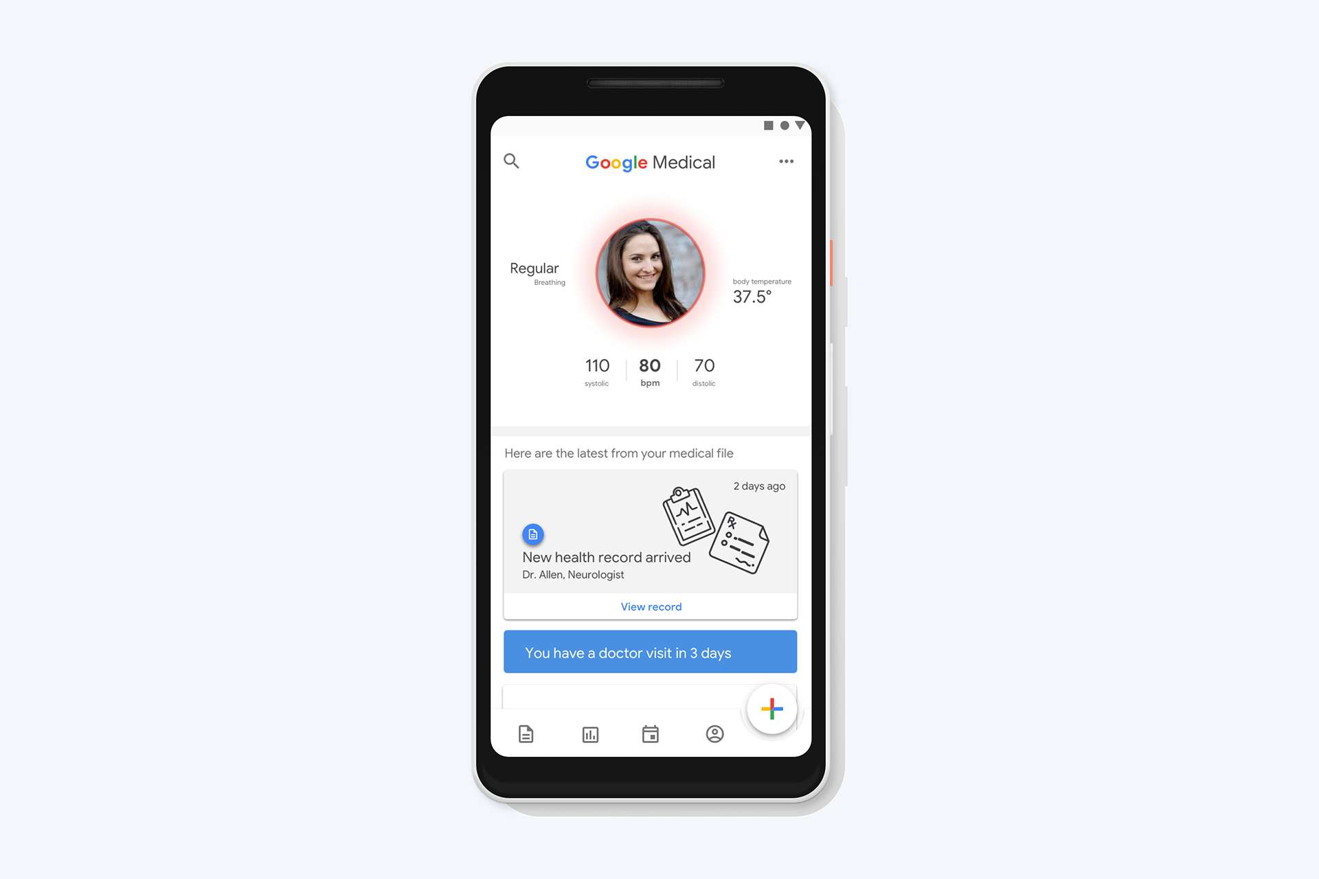
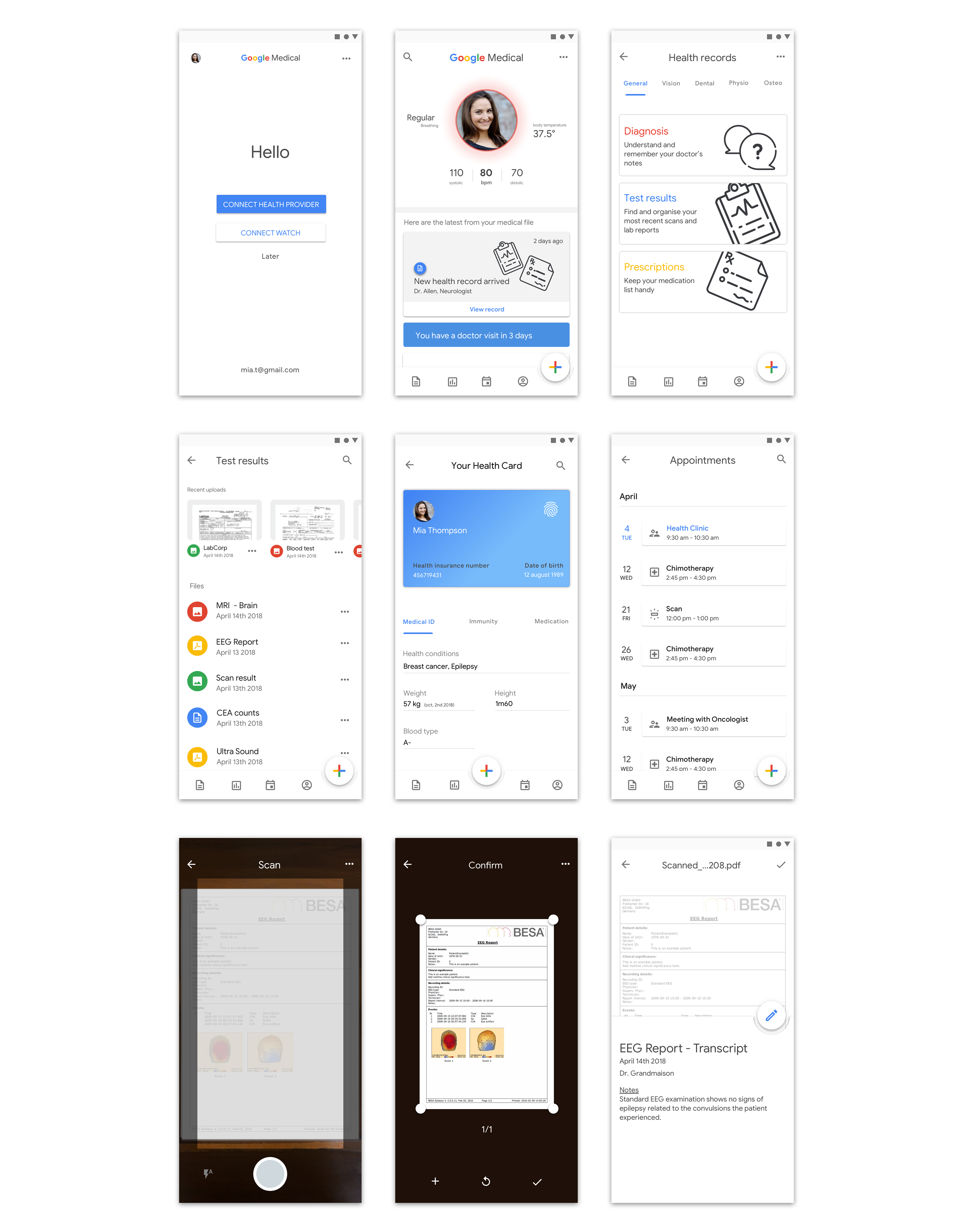
Design
UI design
Outcomes
At the end of this project, I feel like I’ve learnt so much. I was totally new to Android so it was quite a good challenge to design for something I never used before. Time was restricted, there is always more you can do to make an app look and feel better. If I would have had more time, I would have liked to work more on the user flow around connecting health providers to make the app sync new content automatically.