KAUS
Challenge
KAUS is a fictional insurance company looking for a way to modernize their shopping experience and attract more young people, the millennials. They would like to achieve this by building a new web experience and sell their policies directly on it.
Solution
For this project, I looked closely at this targeted group and built a simple and effective quoting flow that would reflect the kind of experience they are looking for.
Research
Before jumping in sketching and generating ideas, I’ve started by doing a research to better understand Millennials needs and desires regarding insurances and learn about Millennial behaviours when it comes to policy shopping. My goal was also to find out what were their most popular frustrations, to take better decisions to build the new website experience.
Interviews
I've then interviewed 5 people between the age of 24 and 35 years old and all considered Millennials (born between 1980 and 2000) through 1:1 sessions. Interviews were conducted in person, in their home environment.
What I understood from these interview is that Millennials wants to do things quickly online, but want to find informations easily if they have doubts. Or else, they leave the site. Often, current insurance website are seen as too full and overwhelming.
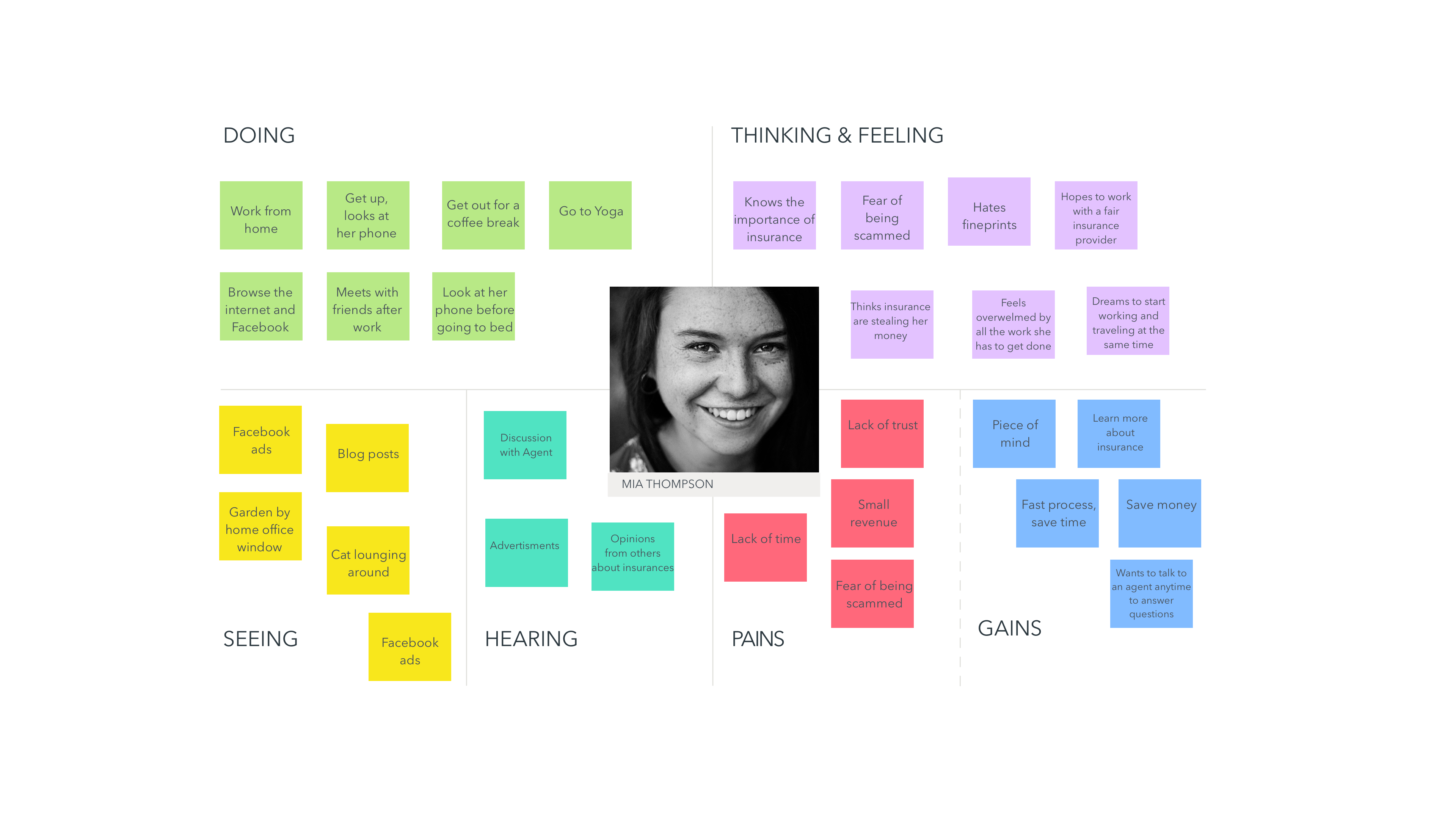
A day in the life of Mia
From the interviews, I've decided to map out the reality of a typical user, Mia - showing what a day in her life looks like and how it affects her decisions process when looking at an insurance company.
Competitive Analysis
As attracting the Millennials in on everyones lips at the moment. I was curious to look at what other insurance and financial companies did to solve this challenge. What I encountered is that those who want to target this audience usually have a specific offer just for them - in a seperate page / website. Thinking for example that life insurance is more interesting for mid-life users, car and home insurances are more likely to be a good products to offer the millennials before introducing them to other types.
Defining the experience
The important bit here, was to create a quoting flow that was effective, fun and clear. Where it would take only a few clicks to get a quote.
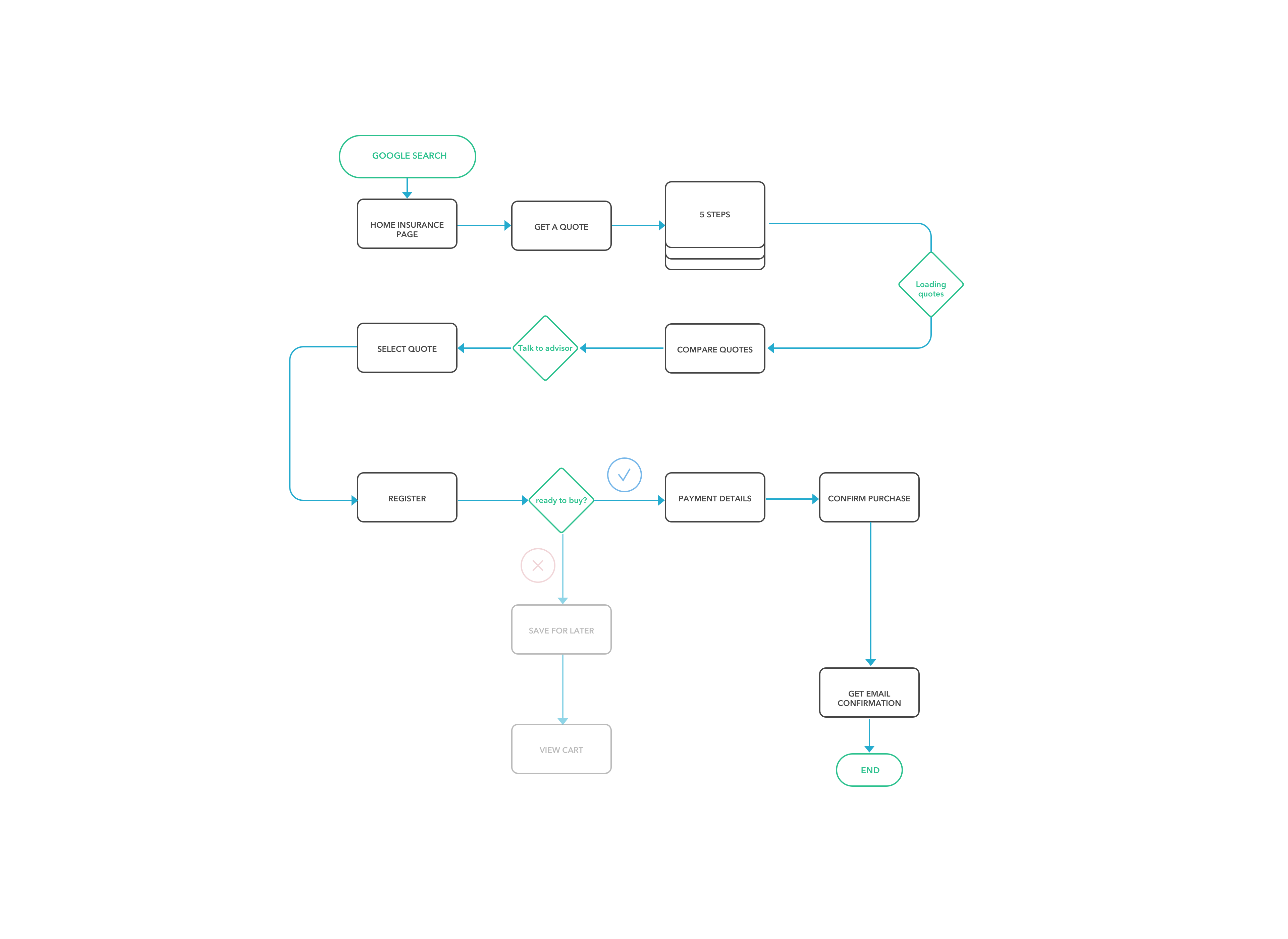
User journey
I created a task flow to picture how a user would get from the homepage to getting a quote.
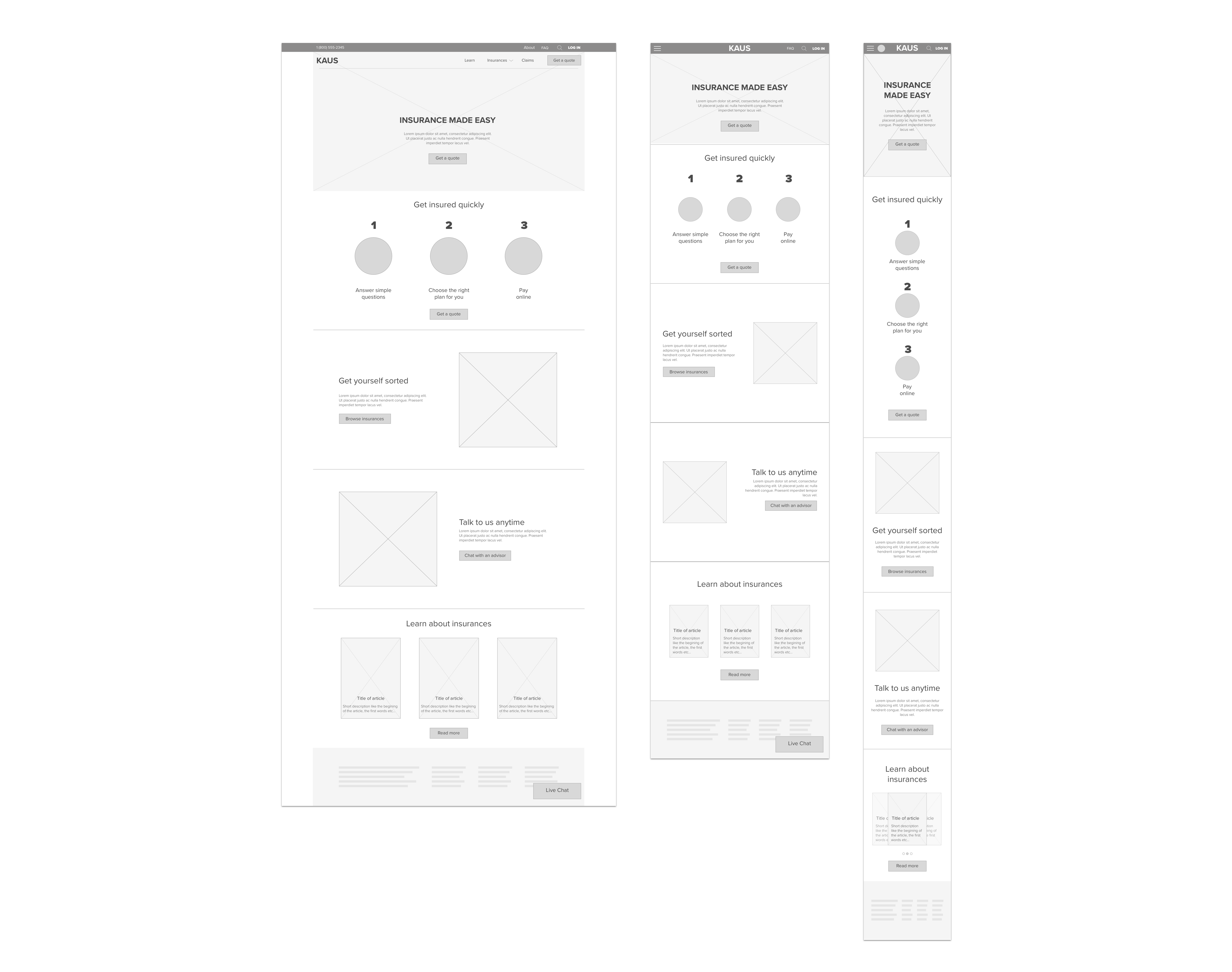
Mid-Fidelity Wireframes
Homepage
Everything starts from the homepage. How can we get the user to start the quoting process? Coming back from what I found out from my research, Millennials wants to do things quickly online, but want to find informations easily if they have doubts. If the information is hard to find, they leave the site. I made the top navigation bar and accessible place to get answers quickly from any pages of the site. There you can click the search icon to write your request, access the FAQ page or contact an agent.
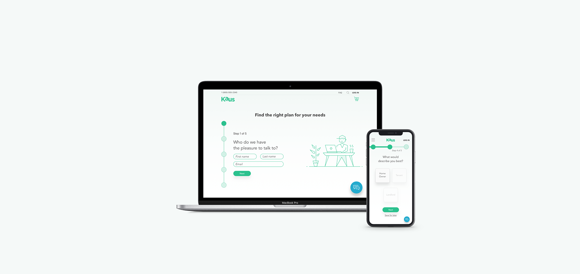
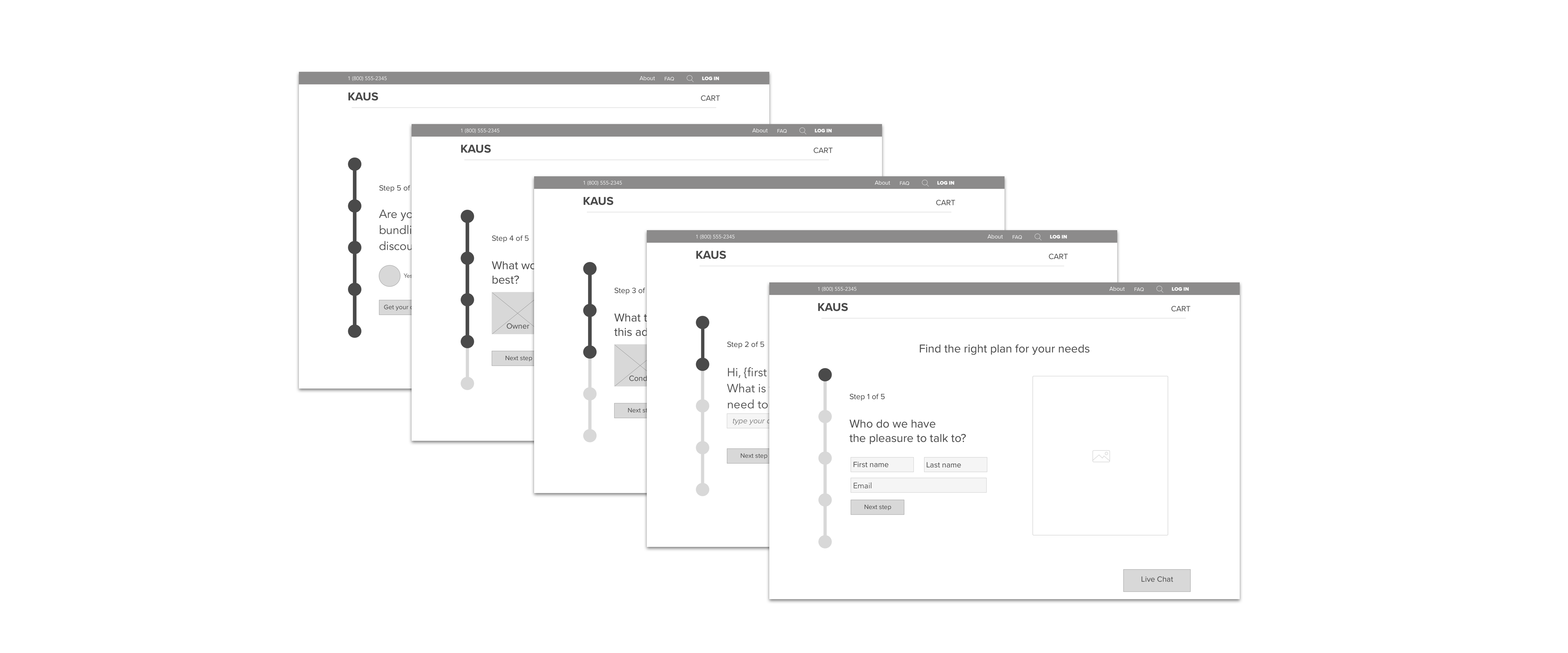
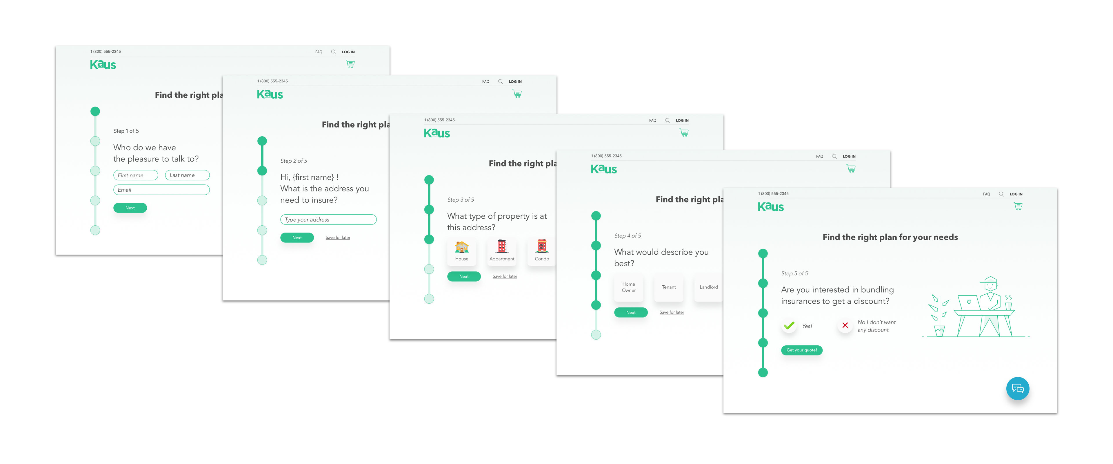
Getting a quote
My main focus was to create a quoting process that was easy to get through. A step-by-step visual that shows the user where in the form they are and how much there is left. They can contact an agent at anytime during the process through a live chat and if the user needs to leave before getting the quote, their informations are saved so they can get back to it later.
Design
Branding
This projects required me to not only build a user experience but also do a rebrand proposal for this insurance company. My intent was to give Kaus a younger look with light colours. Moving from the traditional blue concept of a business/finance style to a more playful brand.
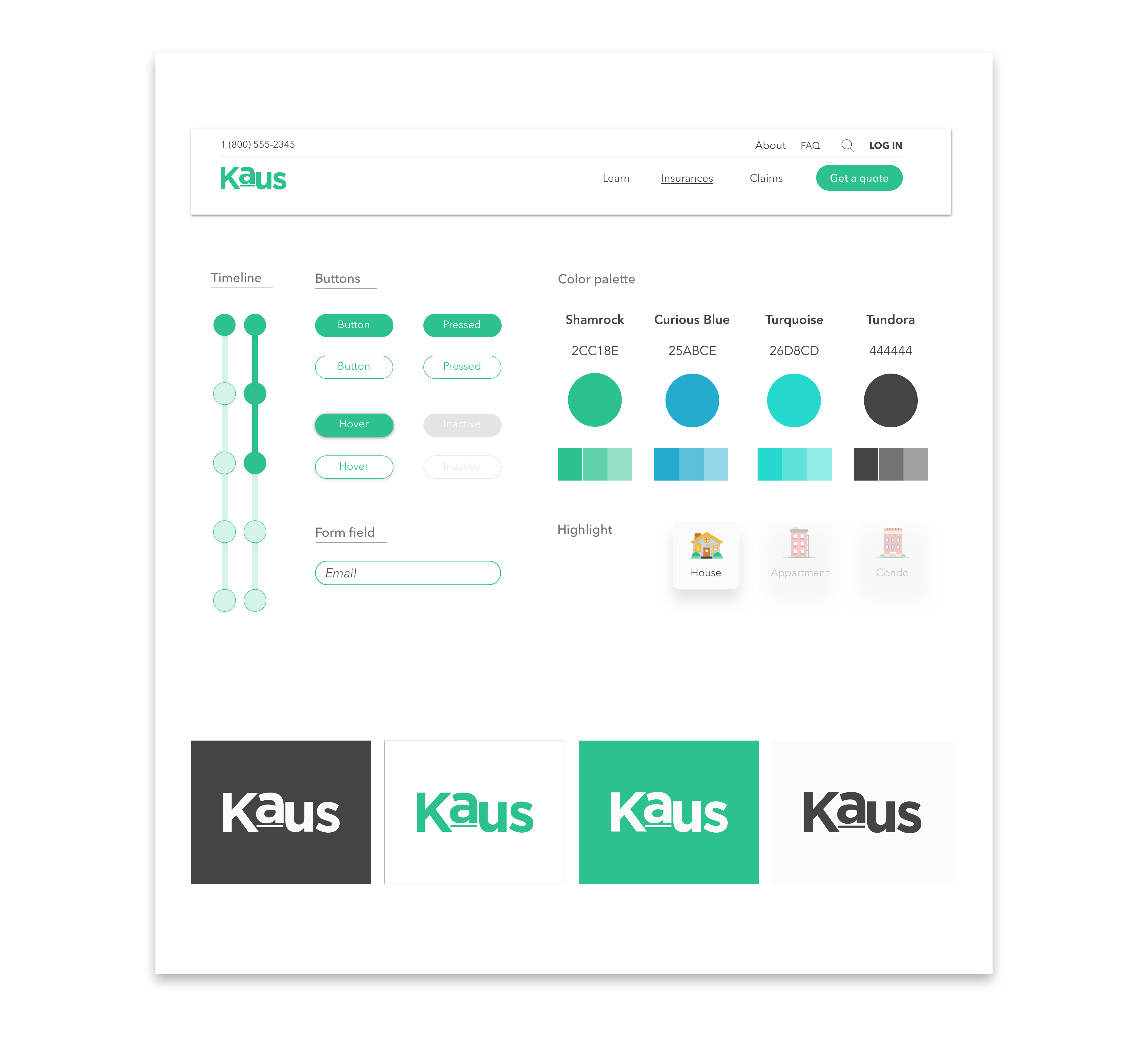
UI design
I've designed the UI thinking of it with a scrolling animation. When you get to a next step of the quoting flow, the timeline fills up and the content scrolls up to reveal the next step content.
Outcomes
I finished this project by doing some usability testing to find where was some UX mistakes. I reviewed it with users but also with experienced UX designers to get their feedback on how I could have done things better. I realized that integrating good copy in the prototype is crucial for the testers to understand. You can have amazing wireframes, but with only "lorem ipsum" to go around, your tester will get lost.
This was my first every website design project and I've definitely learn a lot. I got more confident using tools like Sketch and understood the importance of process.